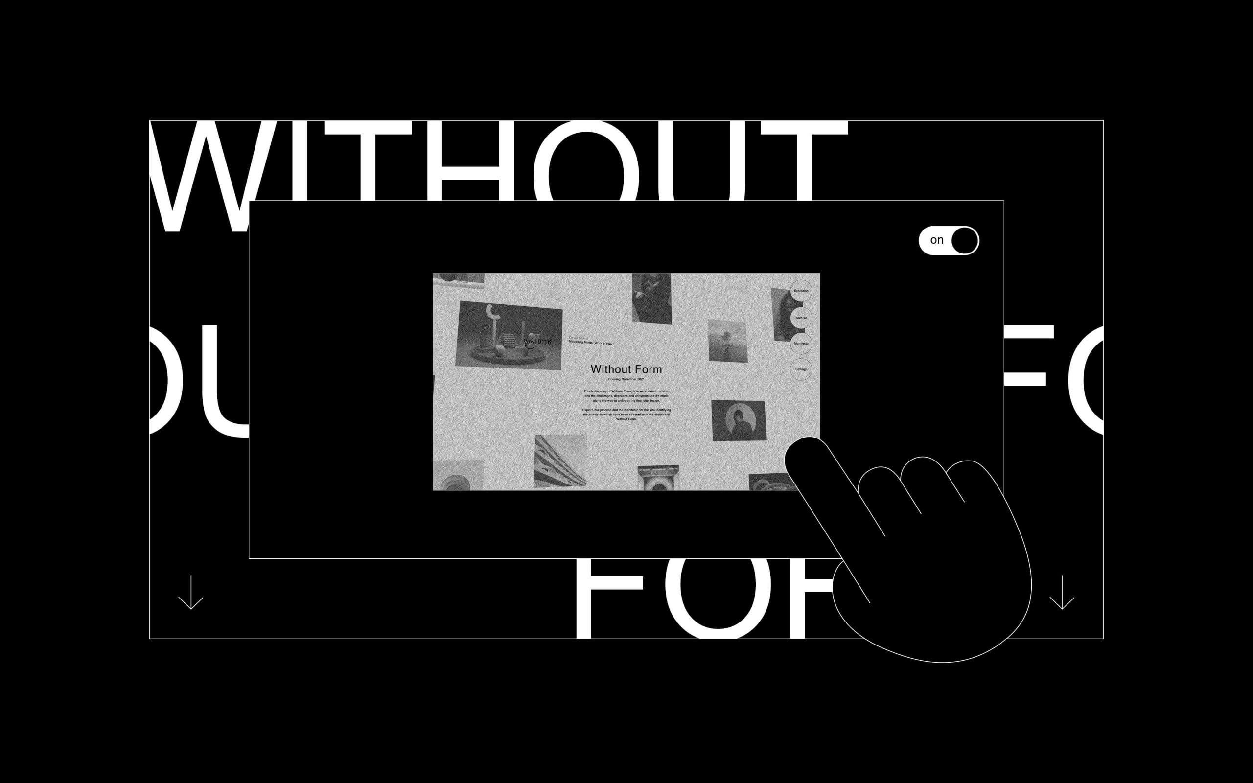
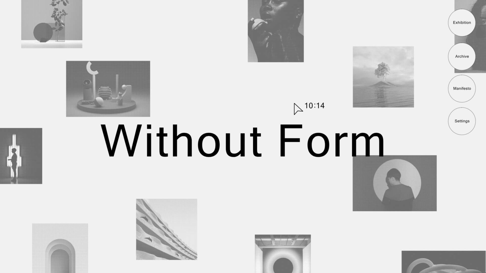
Without Form
A brand new exhibition space
3 min read
Without Form is a new virtual exhibition space which will showcase the experimental work of London College of Communications students and alumni. It will house a series of curated exhibitions throughout the year each responding to a specific brief set by the exhibitions team at London College of Communication. The intention is to use the space to promote the different disciplines and the diversity of work undertaken across the college, encouraging discourse and an open dialogue between the college, students, partners and members of the public.
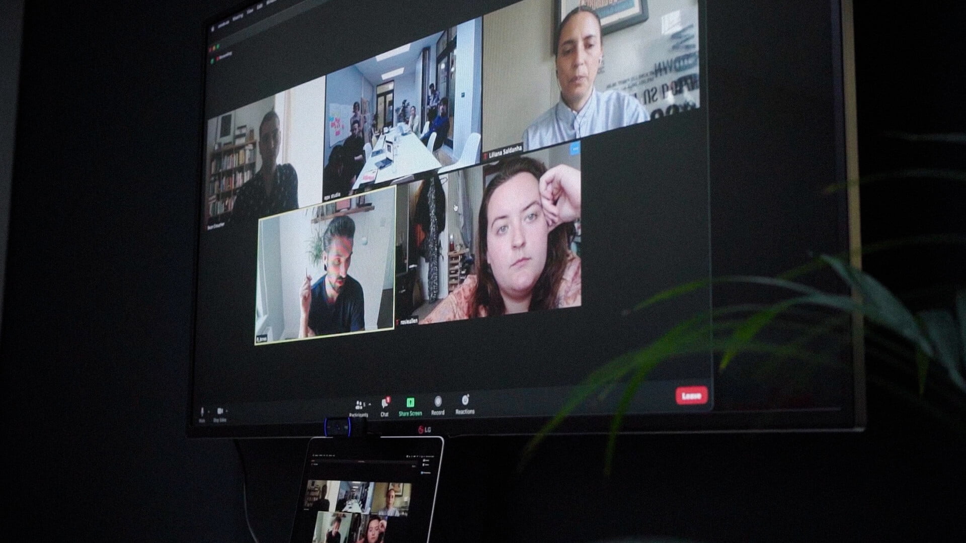
Its creation has been a collaboration between OPX Studio, the developers Mallard and Claret, the London College of Communication Exhibitions Team and recently graduated students from the Information and Interface Design course. Each member of the team brought a different discipline and perspective to the project.
Our collective ambition was to design and build a site which was both environmentally sustainable and inline with the University of Arts London accessibility standards.
The challenge was how to create a low impact, accessible site – without compromising the experience.
Understanding the process that exhibitors have gone through to create the work included on Without Form will be an important part of each exhibition – so we are starting with our process, how we created the site and the challenges, decisions and compromises we made along the way to arrive at the final site design. The process was recorded by OPX Studio and students from the BA Film and Television and BA Photojournalism and Documentary Photography.
3 min read
Without Form is a new virtual exhibition space which will showcase the experimental work of London College of Communications students and alumni. It will house a series of curated exhibitions throughout the year each responding to a specific brief set by the exhibitions team at London College of Communication. The intention is to use the space to promote the different disciplines and the diversity of work undertaken across the college, encouraging discourse and an open dialogue between the college, students, partners and members of the public.
Its creation has been a collaboration between OPX Studio, the developers Mallard and Claret, the London College of Communication Exhibitions Team and recently graduated students from the Information and Interface Design course. Each member of the team brought a different discipline and perspective to the project.
Our collective ambition was to design and build a site which was both environmentally sustainable and inline with the University of Arts London accessibility standards.
The challenge was how to create a low impact, accessible site – without compromising the experience.
Understanding the process that exhibitors have gone through to create the work included on Without Form will be an important part of each exhibition – so we are starting with our process, how we created the site and the challenges, decisions and compromises we made along the way to arrive at the final site design. The process was recorded by OPX Studio and students from the BA Film and Television and BA Photojournalism and Documentary Photography.
The challenge
When we visit a website, data must be transferred from the site’s servers, across the internet infrastructure to your computer or phone. Transferring data uses energy and using energy means burning fossil fuels. When fossil fuels are burned, they release large amounts of carbon dioxide, a greenhouse gas, into the air. Greenhouse gases trap heat in our atmosphere, causing global warming. And websites have got bigger and heavier – in 2010 the average page weighed less than 500KB. Today the average individual web page is around 2MB. The heavier the site, the more data is transferred the more energy is used.
There are multiple statistics which translate weight to the amount of CO2 and these differ depending on what you are looking at, but the principle remains consistent, the heavier a web page, the more energy used, the more CO2 created. If the internet was a country it would be the 7th largest polluter, according to the Sustainable, web manifesto.
We set out with a target weight for the full populated site of 5MB. We are yet to see if we will achieve this. Now at launch the site is 480.86kb – just under half a megabyte.

Starting out
In April 2021 we started the research, looking at existing sites both for exhibition spaces and other low impact sites. From a design perspective we wanted to consider how exhibition platforms ensure the design of the site did not overshadow the individual work of the exhibitors and how they accommodate work of vastly different styles and nature. And how the design of the site can increase or decrease energy consumption – how stripped back did a low impact site need to be?
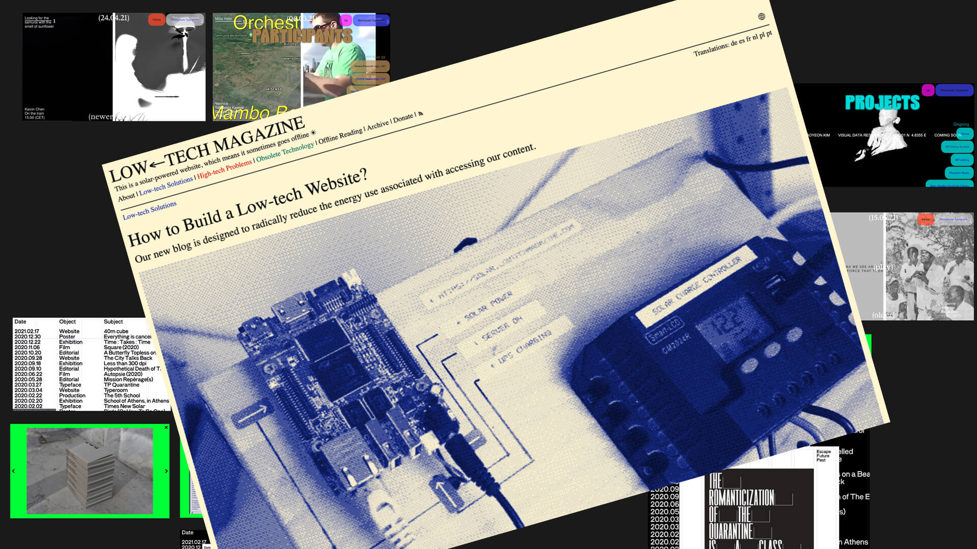
One site really stood out – Low Tech Magazine is all about green energy. The site runs on a solar-powered server located in Barcelona. As the servers run out of energy the page background page colour transitions from cream to white. When the weather is bad for a long time, the site goes offline. The reason why it’s constructed this way is to drastically reduce the energy needed to access the site’s content.
Starting out
In April 2021 we started the research, looking at existing sites both for exhibition spaces and other low impact sites. From a design perspective we wanted to consider how exhibition platforms ensure the design of the site did not overshadow the individual work of the exhibitors and how they accommodate work of vastly different styles and nature. And how the design of the site can increase or decrease energy consumption – how stripped back did a low impact site need to be?
One site really stood out – Low Tech Magazine is all about green energy. The site runs on a solar-powered server located in Barcelona. As the servers run out of energy the page background page colour transitions from cream to white. When the weather is bad for a long time, the site goes offline. The reason why it’s constructed this way is to drastically reduce the energy needed to access the site’s content.
The brief
Through a series of workshops both virtual and face to face we agreed on the brief, our ambition for the site and the parameters we would need to work within. We considered our users – their needs and expectations. And the content we would be publishing – the type of content, the frequency of publication and how long it would remain online. All vital considerations when designing for accessibility and a low impact site. The output of this work became our manifesto, which sets out the principles we have adhered to in developing the site and how the site will be developed going forward.
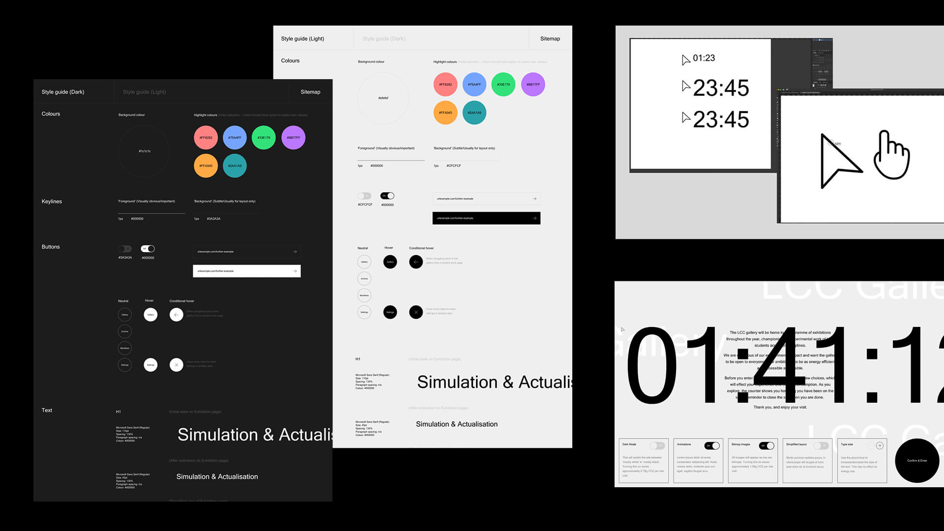
When considering a low impact site, an exhibition platform has an additional challenge – which is not wanting to or being able to control the exhibition content itself, thereby limiting the creativity of exhibitors. Our conclusion – the simpler the experience the better, both visually, so as to allow the exhibitors work to be the hero and functionally to ensure it is easy to use. The longer someone spends on a site, the more energy is used. We considered taking an extreme step and limiting the time spent on the site. Colour also has an impact, energy use increases with the use of bright colours, we found out that Blue uses 35% more energy and that black uses the least energy. From a design perspective gradients, bevelled corners, drop shadows and custom fonts were all out.
The brief
Through a series of workshops both virtual and face to face we agreed on the brief, our ambition for the site and the parameters we would need to work within. We considered our users – their needs and expectations. And the content we would be publishing – the type of content, the frequency of publication and how long it would remain online. All vital considerations when designing for accessibility and a low impact site. The output of this work became our manifesto, which sets out the principles we have adhered to in developing the site and how the site will be developed going forward.
When considering a low impact site, an exhibition platform has an additional challenge – which is not wanting to or being able to control the exhibition content itself, thereby limiting the creativity of exhibitors. Our conclusion – the simpler the experience the better, both visually, so as to allow the exhibitors work to be the hero and functionally to ensure it is easy to use. The longer someone spends on a site, the more energy is used. We considered taking an extreme step and limiting the time spent on the site. Colour also has an impact, energy use increases with the use of bright colours, we found out that Blue uses 35% more energy and that black uses the least energy. From a design perspective gradients, bevelled corners, drop shadows and custom fonts were all out.

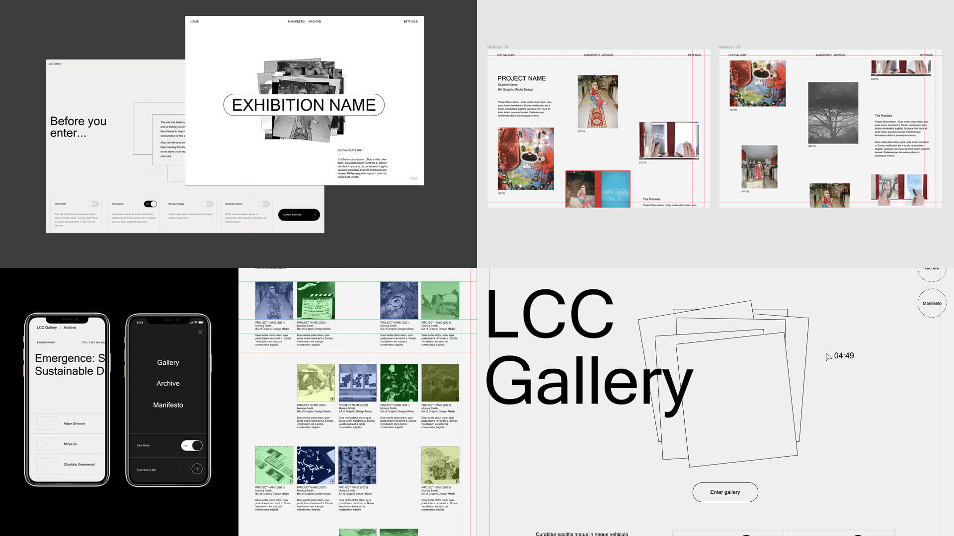
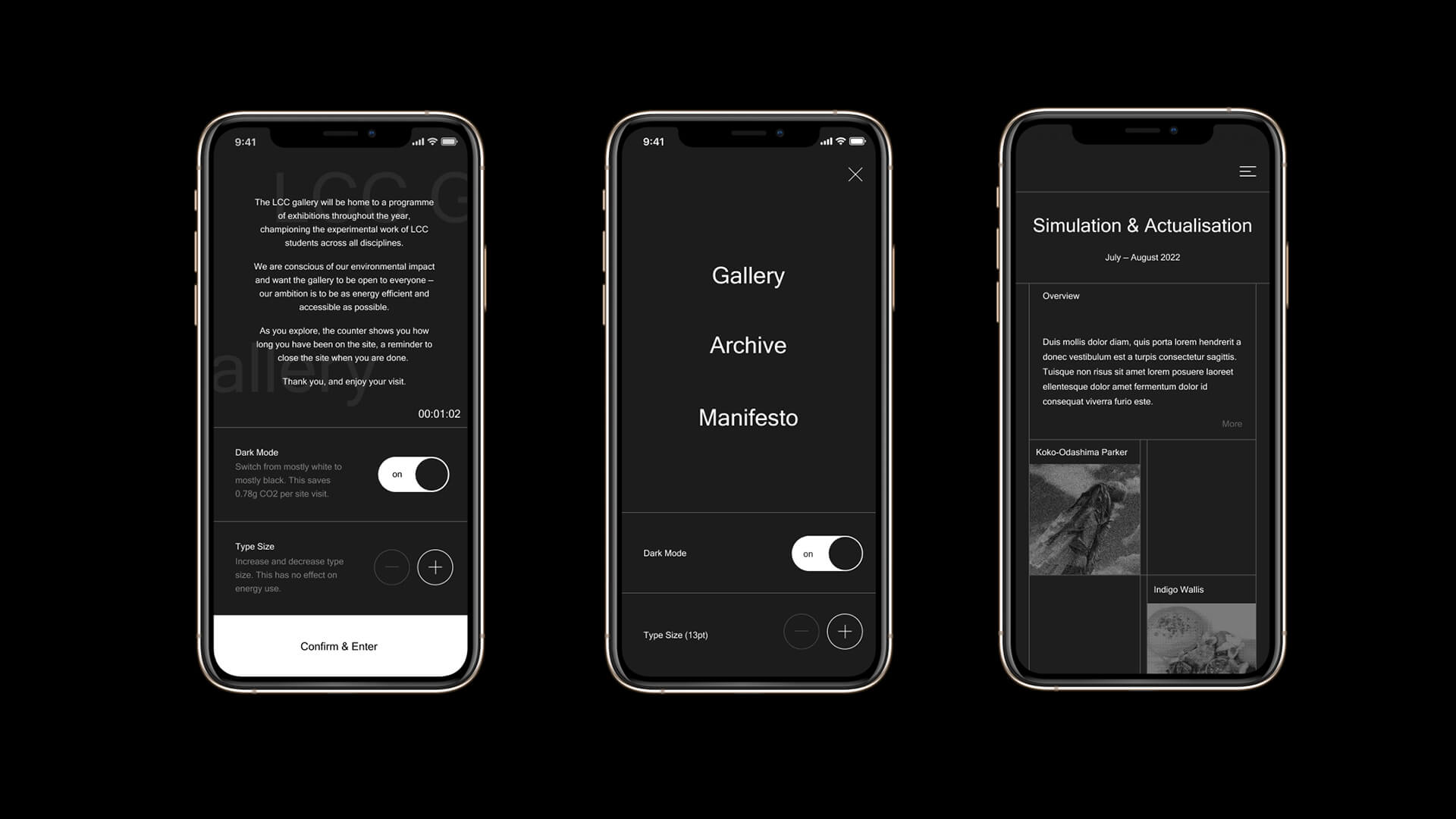
Prototyping
Having agreed to the brief and our parameters, we were able to look at the user experience and how the site would be structured. We considered different options for the exhibition pages - wanting to ensure there was no obvious hierarchy to how work was displayed, but mindful of accessibility we created a simplified view of the same content. We also considered creating separate project and process pages, potentially doubling the size of the site and ultimately settling on one page which would contain both the exhibit and the process. The site uses Microsoft Sans Serif, a system font which only has one weight. Buttons are flat, so that can be created as code rather than an image, and no background images or textures are used. Colour is minimal, selected to minimise the amount of light emitted by the screen. A compromise to create a richer experience was to use simple animations in the background of pages. These animations can be turned off to further reduce the size of the site and enable users to see the difference this makes.
Creating a prototype using Figma enabled us to explore all aspects of the experience, including the design of the gateway which asks users to make choices before entering the site. This gateway also prevents bot traffic from easily accessing the site and wasting valuable energy. Rather than limiting time on the site we have turned the cursor into a counter, a visual reminder that the more time spent the more energy is used. This is not to discourage active use, but so many of us leave a website open, long after we have stopped looking at it. We made the decision to default to low resolution bit mapped imagery, giving the user the choice of whether they view a full colour image or access video.


Build
When we went into build we were still exploring the impact of certain design decisions on the weight of the site. The site uses HTML, CSS and Javascript for the animations. The code files are ‘minified’ to reduce their size and where possible code was reduced to as few files as possible. A headless CMS 'Contentful’ was used. This separates the code from the content meaning the CMS itself has no bearing on the performance or energy efficiency of our site. And because all we are doing is asking it for the data we want, we don't have to bear the load of the CMS code as you would with a traditional CMS. The biggest challenge is how we calculate the amount of energy being used dynamically in real time, translating this accurately into carbon emission.
Finally
The final element to our process was to come up with a name – a name for the space which captured what we were trying to achieve and the ambition of the project. A brainstorm of potential options led to the selection of Without Form. A name which seemed to sum up what the site was all about. The exhibition space is open to everyone – with no expectation of what will be exhibited or the format it will be created in. The space itself may be virtual, with no physical form or if it takes a physical form, what form that is will depend on what is exhibited. And the internet itself is without form, simply data which is being transferred from one super large computer to another.
Special thanks to our collaborators
Mallard & Claret
Christine Zhang
Matt Richmond
Cain Suleyman
Yue Hou
Special thanks to our collaborators
Mallard & Claret
Christine Zhang
Matt Richmond
Cain Suleyman
Yue Hou
Special thanks to our collaborators
Mallard & Claret
Christine Zhang
Matt Richmond
Cain Suleyman
Yue Hou
Special thanks to our collaborators
Mallard & Claret
Christine Zhang
Matt Richmond
Cain Suleyman
Yue Hou
Special thanks to our collaborators
Mallard & Claret
Christine Zhang
Matt Richmond
Cain Suleyman
Yue Hou